


How to Visualize the U.S. Output Gap with FRED’s Tools: A Guide to Tracking Economic Cycles
A Step-by-Step Tutorial to Calculate and Chart the Output Gap Using FRED’s Built-In Features

I like to digging into economic trends, and one metric I find endlessly fascinating is the output gap. It’s like a snapshot of the economy’s health, showing how far actual output (Real GDP) is from what the economy could produce at full capacity (Real Potential GDP). A positive gap suggests the economy’s running hot, while a negative one points to slack, often tied to recessions. The best part? You don’t need to be an economist to explore this, anyone with a curious mind can dive in using the Federal Reserve Economic Data (FRED) database. In this tutorial, I’ll show you how to calculate and visualize the output gap directly on FRED’s website, using its built-in tools to pull GDPC1 (Real GDP) and GDPPOT (Real Potential GDP), compute the gap, and create a chart with economic cycles highlighted.
What Is the Output Gap and Why Does It Matter?
The output gap is the difference between Real GDP (what the economy’s actually producing) and Real Potential GDP (what it could produce at full capacity). A positive gap means the economy’s overstretched, risking inflation. A negative gap signals underperformance, often linked to unemployment or idle resources. Policymakers use this to guide decisions—like whether to raise interest rates or boost stimulus—and it’s a great tool for anyone curious about economic cycles.
Step 1: Navigating to FRED’s Graphing Tool
FRED, run by the St. Louis Fed, is a treasure trove of economic data, and its graphing tool lets you create custom charts without downloading anything. Here’s how to start:
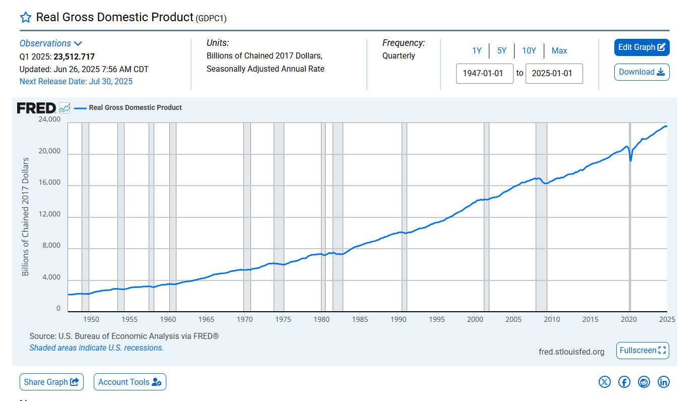
Go to fred.stlouisfed.org or right to the GDPC chart fred.stlouisfed.org/series/GDPC1#
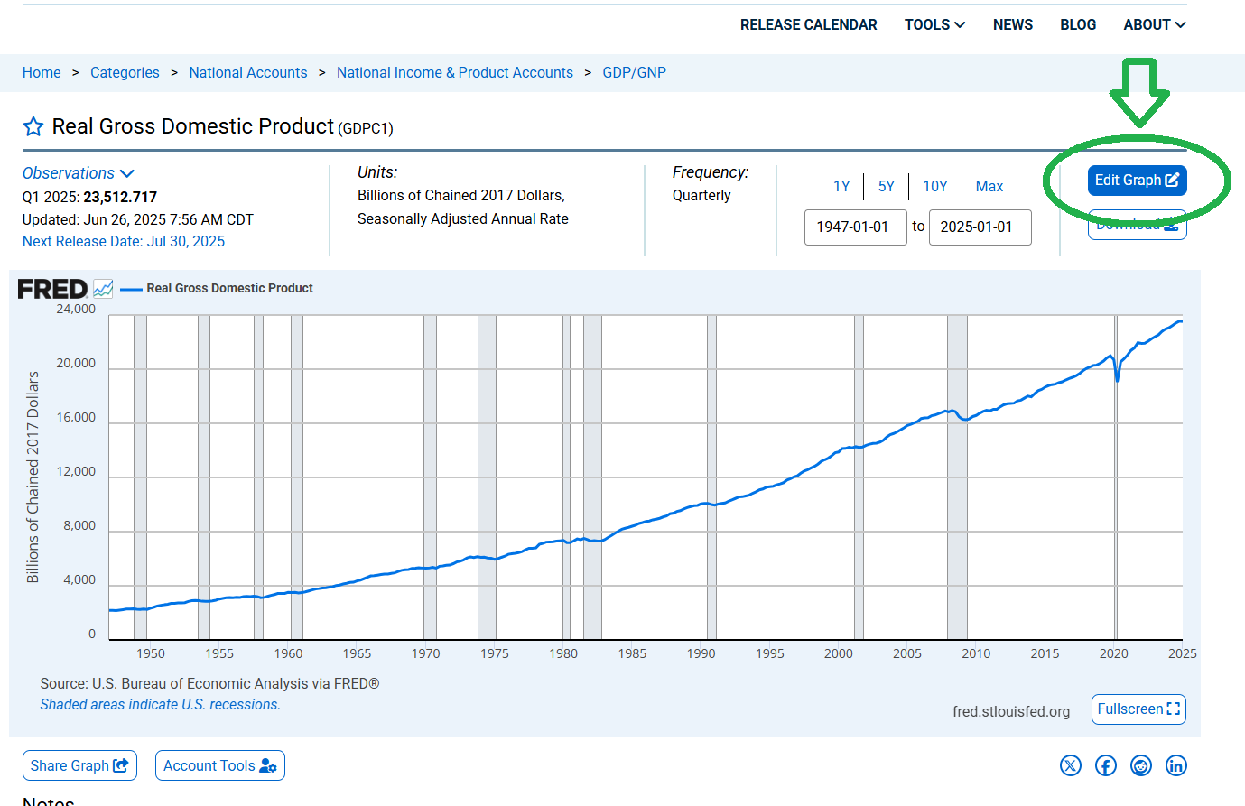
Click the “Graph” button in the top menu to open FRED’s graph builder.
You’ll land on a blank graph page ready for data series.
We’ll use two series:
GDPC1: Real Gross Domestic Product (billions of chained 2017 dollars, quarterly, seasonally adjusted).
GDPPOT: Real Potential Gross Domestic Product (same units and frequency).
Step 2: Adding Data Series to the Graph
Let’s add our two series to the graph:
In the graph builder’s search bar, type “GDPC1” and select “Real Gross Domestic Product (GDPC1)”.
Click “Add to Graph”. You’ll see Real GDP plotted as a line.
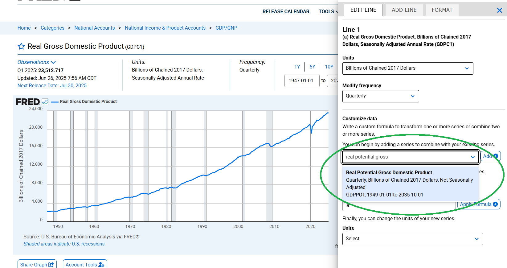
Repeat for “GDPPOT” (Real Potential GDP). Now both series are on the graph, but they’re on the same axis, which can be hard to compare since their values are large.
If you already on the chart, tap the “Edit Graph” button and add hte Real Potential GDP to the chart. See figures below.
Edge Case Alert: Both GDPC1 and GDPPOT are quarterly and in the same units, so no frequency mismatches here. If you accidentally pick a series with different units or frequency (e.g., annual data), FRED will warn you when you try to combine them. Stick with quarterly data for consistency.
Step 3: Calculating the Output Gap in FRED
FRED’s graph builder lets you create a custom series to calculate the output gap (Real GDP – Real Potential GDP). Here’s how:
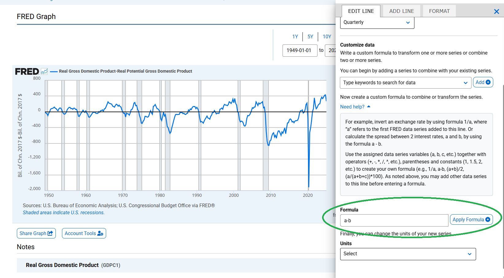
Click the “Edit Graph” button (gear icon) on the right.
In the “Formula” field, enter: a - b, where a is GDPC1 and b is GDPPOT. (FRED assigns letters to your series in order of addition—check the labels.)
Click “Apply” to create a new series showing the output gap in billions of chained 2017 dollars.
To make it more interpretable, let’s express it as a percentage of Potential GDP:
In the “Formula” field, update to: ((a - b) / b) * 100.
This divides the gap by Potential GDP and converts to a percentage.
Edge Case Alert: If the formula doesn’t work (e.g., “Invalid Formula” error), double-check that GDPC1 is a and GDPPOT is b. If dates don’t align perfectly, FRED’s “inner join” logic ensures only matching dates are used, avoiding missing data issues.
Step 4: Visualizing the Output Gap with Recession Shading
Now that we’ve got the output gap, let’s make it pop with a chart that highlights economic cycles, like recessions. FRED makes this easy by letting you add recession bars.
Switch to the Output Gap Series:
In the “Edit Graph” panel, select your custom series (the percentage output gap).
Set the y-axis to show this series only (hide GDPC1 and GDPPOT to avoid clutter).
Add Recession Shading:
Click the “Add Line” button and search for “USREC” (NBER U.S. Recession Indicators).
Instead of adding it as a line, go to the “Format” tab and select “U.S. Recession” under “Add Recession Bars”. This shades recession periods in gray.
FRED automatically pulls NBER recession dates (e.g., 2007–2009 for the Great Recession, 2020 for the COVID recession).
Customize the Chart:
In the “Format” tab, set the date range (e.g., 2000 to 2025) to focus on recent cycles.
Add a title like “U.S. Output Gap with Recession Periods (2000–2025)”.
Label the y-axis as “Output Gap (% of Potential GDP)”.
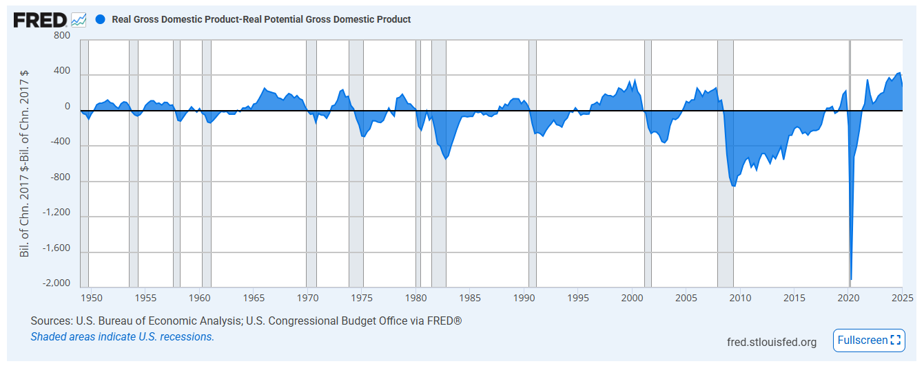
Your chart should now show the output gap as a line, with gray bars marking recessions. Negative gaps during these periods reflect economic downturns, while positive gaps signal booms.Edge Case Alert: If recession bars don’t appear, ensure the USREC series covers your date range. If your chart looks crowded, adjust the date range or hide the original GDP series to focus on the gap.
Step 5: Interpreting the Chart
Your chart tells a story: the output gap dips negative during recessions (like 2007–2009 or 2020), showing the economy underperforming. Positive gaps, often post-recession, suggest overheating. This is a powerful tool for understanding economic dynamics—whether you’re pitching policy ideas or just curious about what drives booms and busts.
Using FRED’s built-in tools, you’ve calculated the output gap and created a slick chart with recession shading—all without leaving the website. This process, using GDPC1 and GDPPOT, shows how the economy swings between booms and busts. It’s a fantastic way to explore economic health, whether you’re pitching ideas to policymakers or just curious about the numbers.
